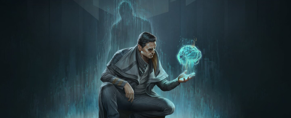
Gamedec Update - UI Q&A
-
Category: News ArchiveHits: 1424

The latest developer diary for Anshar Studios' cyberpunk detective RPG Gamedec brings us an extended Q&A with the game's UI designer Iza Mazur. So, if you're curious about the art of UI design in general, or alternatively wouldn't mind learning a thing or two about Gamedec's UI in particular, you should check it out.
Have a look:
One of the most common but, often unnoticeable aspects of video games is their User Interface. It is hard to design a system in which the player almost immediately knows what to do and everything is clear and easy to use.
Meet Iza Mazur, who tries to bring these factors together, and design a coherent UI to Gamedec – a game of many worlds and genres.
All of the images might be from different stages of game development, please don’t mind the occasional Polish words since this is still a work-in-progress state. :)
GENERAL QUESTIONS
If you'd have to describe what you do in your job to a 10-year-old, what would you say?
I invent and draw all the icons and pop-ups you see when playing the game, changing options, or using your character's abilities. The number of bullets, the inventory, and icons representing items you've gained, simple things like a life bar or a mini-map. Even the screen where you save your progress in the game. This is what I do daily.
When did you decide to become a UI designer?
Spontaneously while working at my first company, when I was tasked with designing some skill icons. My first task was to work on storyboards. After some time, I was assigned to work on UI. It started with a few icons, ended with designing popups, and finally whole screens. As it turned out, most graphic designers hated working on UI, so as one of the few graphic designers who liked it, I was given more and more tasks related to it until I started to be interested in UX. And so it stayed.
Why is UI design so important?
It helps the player grasp the gameplay and understand the game mechanics. If it wasn't for the UI, it would be hard to introduce the player to new mechanics or show how to navigate the game world at all.
What UX information do you need to have before you start designing?
Any that would be useful 😛 But seriously, I need to know what kind of game mechanics the design envisions to determine what screens are required and what would be on them. Screens such as options or the main menu are usually not very problematic. For most gamers, The most demanding screens relate to the development of characters, where there are many elements. Everything depends on what the designers come up with and those unique to a particular game and hard to find references in other games.
GAMEDEC
What were your inspirations for Gamedec's UI?
There were different games at different stages, but mainly the AC series. After so many titles were released in the series, their UI is evident and straightforward. There was also inspiration from Dishonored and Deus Ex.
How would you describe UI design in Gamedec? What was your design process, and how did you validate your decisions?
I started with a box-based sketch to show the placement of elements on the screen and determine if the flow was appropriate. Then I looked for the right style, based on what was done by 3D and Level Designers and the project's overall vision. Once the tone was clear, I made final mockups, which were then approved by the Art Director and given to the developers for review.
How challenging is designing a UI for an isometric game?
It depends on the size of the game and the complexity of the mechanics involved. The challenge is to create a clear UI when there is a lot of data to consider, and with RPGs, there is usually a lot of it. FPP games provide more opportunities for experimentation, at least in my opinion.
But that doesn’t mean that other genres have nothing to offer. To this day, I'm still fascinated by the minimal UI in Dead Space and how it was implemented and "written" into the gameplay.
Was it hard to shuffle the UIs because of how many different environments Gamedec has?
Considering that each world has a dedicated HUD, it was a fun and stress-relieving task. It allowed me to break from creating the main UI and look at everything from a new perspective. I also enjoyed playing with the styles. I moved away from our theme and designed something completely new to fit a particular world.
What element of UI are you most proud to work on?
From in-game UI and codex, They seem the clearest to me, and I hope people will appreciate the intuition of both.
What system needed a general overhaul, and how did it make to a way better design? What was your role in it?
The deduction was definitely the most challenging. It went through the most iterations. Because of the multitude of choices, it was hard to design everything to understand what they should do and why. The concept kept changing. From ordered folders through, somewhat chaotic neural connection, to screens à la Detroit: Become Human. Currently, the screen is a mixture of all the previous ideas. From each, we take the most exciting elements, creating a coherent and readable whole.
How does the feedback from beta-testers and players influence the UI changes in the game?
They help me detect elements that are not intuitive for players. They show what they pay more attention to, what is ignored, and what should be visible. In general, I appreciate the comments of testers and players. It's from them that the most constructive and helpful feedback comes.
What part of the UI do you think people will appreciate the most?
I vote for Deduction because it was the most challenging to make it clear, easy to use.
PERSONAL
What are your design principles? On what do you focus the most?
The most important thing for me is to have a simple and intuitive approach and maintain consistency on the screens. If a player starts to feel lost during the game and doesn't know where to find the information they need at the moment, it means that the UX needs improvement.
Do you often experiment? Do you make any risky moves or just follow the safe path?
During the mockup phase, I usually give several suggestions from 3 categories:Generally, creating the UI is about experimenting with different elements and choosing what will best fit the vision created by the rest of the team. The safe version is the one that already works in many games; the players are familiar with it, so they will certainly not feel lost. The ideas proposed by the team are usually a mixture of the first and third groups.
- safe and proven approaches,
- ideas that were thrown during the brainstorm with the team
- a completely new and unconventional approach
Experimenting is the most fun, but ideas are sometimes hard to implement in the game so that the player does not feel overwhelmed by too many new mechanics. Sometimes, however, there's no need to reinvent the wheel. If certain things exist and are universally recognized, then there is no need to change them. The "X" button is always in the top right corner of the popup, and that's where players will look for it, so placing it anywhere else will cause unnecessary confusion.
What software do you use when designing UI?
A sheet of paper and pencil for quick sketches based on boxes, PS for final mockups, and programs that automatically create textures from cut parts.
How do you keep up with design trends?
I play the latest titles or at least watch streams of them. It's the best way to keep up with trends that change pretty quickly. I'm often helped by player comments or reviews. I then point out elements of the UI that the recipients liked and which they found unnecessary or confusing.
What You Love Most About UI Design?
I have a weakness in drawing icons of all kinds.
What would you do if not UI?
I would draw tarot cards all day :)

