Legend of Grimrock II: Making of Key Art Blog Post
-
Category: News ArchiveHits: 4985

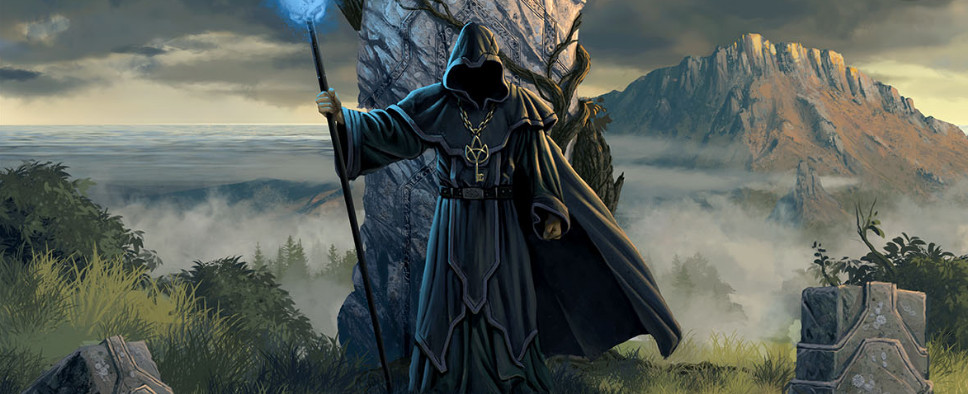
Almost Human Games has published a new blog post concerning the development of Legend of Grimrock II, or, more appropriately, the making of its key art. The image that will be used as a "cover" for the game in the digital stores is shown in full, as is the process behind its making. I'm going to quote a lengthy excerpt, but keep in mind it loses most of its impact without the accompanying images, so you should jump at the link:
We started planning the key art when we got the LoG2 setting finally settled down and felt certain that it was the direction we wanted to go. In our case the key art helped us to focus on the chosen theme and gave us a good vibe and direction to follow. As the game is very oldschool flavored, I wanted it to be reflected in the key art also. So I started thinking of the things and mood we wanted to portray. It took some iterations of sketching to get to the core of what we were after. I didn't want to use any photo based techniques or 3d rendered assets. What I had in mind, was the book covers that got me interested in fantasy art and painting in the first place: Larry Elmore, Keith Parkinson (r.i.p) and Brom. They are my all time greatest heroes and I wanted to give my humble tribute to their art, like Grimrock gives to games of that era. In perfect world I would've wanted to do the image in oil paints, but after reality check, the digital medium was the only logical choice. It has many benefits and one doesn't have to wait for the pixels to dry. I tried to keep a painterly feel to the image and didn't use (too perfect) tools that Photoshop offers.
I started sketching with the traditional book cover or poster aspect ration and then expanded the sketches I liked to horizontal format. Legend of Grimrock 2 will be on a couple of different digital stores that all have their own graphical styles. Some are leaned more towards horizontal images and some have more traditional vertical images. The different aspect ratios also gave some challenges to the composition of the image. I wanted to try to come up with an image that would work well with both horizontal and vertical images.
The painting took close to five full packed days to complete. It's painted in Photoshop around 6500 pixels wide to help the brushes work better, but still maintain good enough computer performance. The image was a really fun little project to complete and we hope you guys also like it. We feel that it captures the feeling of LoG2 pretty well. I also recorded some painting stages to better illustrate how the image came together. Now go on and check out the big version of the final image.

