Obsidian on Modernizing the Art of the Isometric RPG
-
Category: News ArchiveHits: 3068

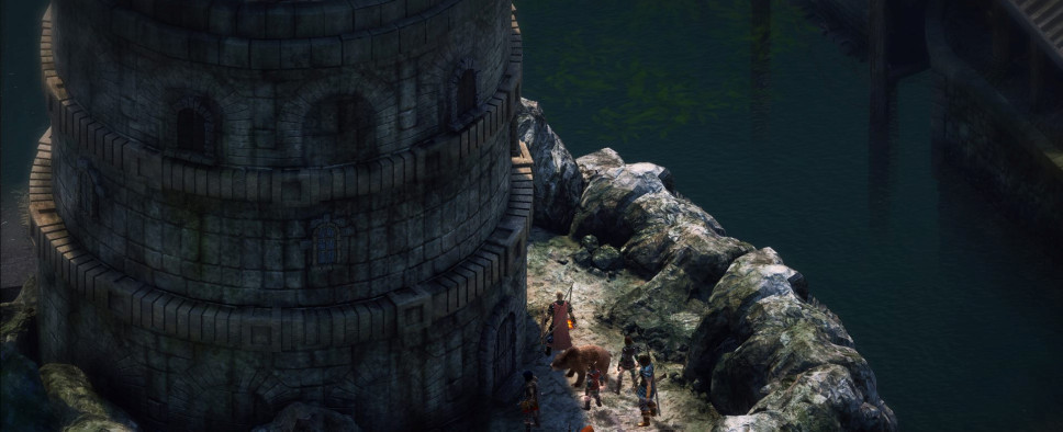
With Pillars of Eternity and Tyranny, Obsidian Entertainment was going for a look reminiscent of the Infinity Engine games. The caveat there was that they had no idea how to achieve that look with modern technology and were forced to figure stuff out as they went along. In this Rock, Paper, Shotgun article you can read all about that iterative design process (read – trial and error) that ultimately gave Pillars and then Tyranny their familiar, yet distinct art style. An excerpt:
“We had no idea how the tech would even work at the time,” says Adam Brennecke, executive producer on Pillars of Eternity. “The next eight months of development was trying to figure out how to actually make a game that still looked like the Infinity Engine.”
Recreating the aesthetic of a fifteen-year-old, two dimensional RPG sounds like it should be easy, especially with the technology available to today’s developers. But Baldur’s Gate was built on a unique and highly idiosyncratic engine, using a rendering technique that has been somewhat lost to the ages. The problem revolved around Baldur’s Gate’s use of pre-rendered backdrops. Pre-rendering was a clever way of creating detailed, high-resolution environments at a low cost to performance, as the static image means the computer doesn’t have to redraw it with each new frame.
Today, there’s no need for pre-rendering because games can render stunning 3D environments in real-time. Nevertheless, this was the approach Baldur’s Gate used and Obsidian needed to mimic that to live up to their promise. But to look good on a modern PC screen, a pre-rendered image needs to be many times sharper and more detailed than back in 1999.
In theory, this isn’t a problem. In fact with today’s computers you can potentially render an image with an infinite number of polygons, something that Obsidian had a lot of fun experimenting with. “Our backgrounds, they have millions and millions of really high poly, highly dense geometry, and the art-team just go wild with it.”
The problem is that rendering these images at such detail takes a lot of time. “It takes days to render these images out, because they’re so high-res, they’re 10,000 by 10,000 pixels,” says Brennecke. “It’s more like how a movie is made, where you need a fat renderer farm with a lot of computers churning out these really highly dense, really crazy images all night and all day….that was a big learning process for us, how to hit that balance and figure out how to render things offline.”
Alongside the brute-force of rendering these images, Obsidian needed to adapt the Baldur’s Gate style to suit these sharper images. For inspiration, the art team looked to the Hudson River School, a 19th Century American art movement which produced pastoral landscapes heavily influenced by romanticism. Meanwhile, one of Obsidian’s engineers, Michael Edwards, created a pixel shader that accurately mimicked the Infinity Engine’s approach to rendering. “It was a very accurate representation of how the Infinity engine kind of did their rendering pipeline,” Brennecke says.
With the basics in place, Obsidian created their first dungeon, only to find it looked nothing like Baldur’s Gate. So they went back to Baldur’s Gate and re-examined that game’s aesthetic from every possible angle. “There were a lot of little tricks that they learned how to present the image. For example, especially for interior areas, the front-facing walls are all not there. You don’t draw those at all.” Brennecke says. “The tops of the walls are all black. So it makes, like, where this image is sitting in a black void. Our first prototype dungeons didn’t look anything like that.”
Obsidian’s art team also struggled adjusting to drawing isometric backdrops in general, not only making environments look nice, but also appear proportionally correct from that perspective. “For any height difference, you need a ramp to connect those heights, and whenever you have a ramp that is sloping away from you, it ceases to read as a ramp in our mind because there is no perspective, there is no sense of depth,” says Kaz Aruga, concept artist on Pillars of Eternity and lead artist for Pillars 2. “As you go up the image, you want to make sure it’s increasing in height, not decreasing.”
Eventually, the art-team focussed on developing one area, a tavern interior, with a mind to replicating the Infinity style as accurately as possible. “When we got it into the game, we were like ‘Hey that looks good, we hit the mark with that.’ Then we designed our dungeons with all that in mind,” Brennecke says.

