The Iron Oath Update #44
-
Category: News ArchiveHits: 1268

The June 2019 development update for Curious Panda's gritty turn-based RPG The Iron Oath starts off by telling us a bit about the game's recently revamped character portraits and then showcases its management UI. If you're interested in seeing that UI for yourself, you might want to click the link above, but here are just the text parts:
Hello backers! For our June monthly update we have a few more UI related things to share with you again. We're really pleased that you all liked the new look for the combat UI (which can be found here if you missed last month's update), and this time around we'll be sharing the management UI with you.
Before getting to that though we wanted to share a prototype that I've been working on for character portraits. In our original plans, we were just going to have one design per class (eg. The Pyrolancer's portrait would have one specific look, and aside from hairstyles and colors it would never change), but from a player customization point of view, we think it would be better if we made 5~ faces per gender that are not class-specific, along with the ability to customize hair, hair color, armor, headgear, scars, tattoos etc. We'd like to hear your input on this and if you agree that it would be the way to go! If we do indeed go the latter route, we will have class icons in the corner of portraits so that there is no confusion about which class a character is.
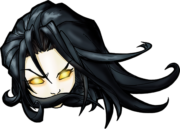
So with that said, I started with working on one single face type to establish a style for the portraits as seen below[...]
I then started adding various layers which would be randomly assigned when a character is created in the game (with the ability for the player to later customize these things in the management screen). Here are some of the current possibilities[...]
Obviously we will have a few more choices for the various elements in the end, but for now as a proof of concept I'm fairly pleased with the amount of variety that we can get from a single face, and with 5~ per gender there should be plenty to work with to achieve unique looking characters within your roster.
Moving on then, here's how the management UI will look from the overworld screen. Please bear in mind these are just mock ups, as Chris is still in the process of skinning the screens in the actual game, but the look will be virtually identical :)
[...]
As you can see in the Overview screen, there's quite a bit of space for various statistics to be displayed. If there is anything that you would like for us to possibly track and share with you the player, we'd love to hear your ideas!
The UI is being designed with controller support in mind, so while it will probably be most efficient to use mouse & keyboard, you will have the option to use a controller on PC if that is your preference!
We hope you like the look of everything, we should be able to show it off in-game within the next couple updates. If you have any questions or suggestions about the UI (or the portraits) we're open to hearing it of course. Thanks for reading and see you next month!

