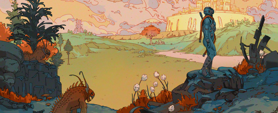
The Outer Worlds - Exploring New Frontiers of Color
-
Category: News ArchiveHits: 1125

Obsidian Entertainment's sci-fi RPG The Outer World stands out among the competition in no small part thanks to its vibrant color palette. And if you’d like to know how Obsidian arrived at such a distinctive visual style for their latest title and the inspirations behind it, you should check out this GamesIndustry.biz interview with Obsidian’s art director Daniel Alpert. An excerpt:
"[They told me] it's going back to a bunch of RPG roots where it's a player's-choice-heavy narrative, but at the same time we wanted to play with the idea of colonization of space," Alpert says. "You weren't going to a world that's been there more than a thousand years. You were almost starting brand new in this new world, so how would people react within that world?
"Right away when I started hearing that, I pretty much had Western tones -- The Old West -- in my head. Ok, we're going to be a frontier kind of space colony, so why don't we play with what we know as a frontier landscape and put that into the world? With that, we pretty much set the groundwork of what we wanted."
Beyond that, Alpert says Boyarsky was keen on having a strong element of heavy machinery in the visuals as well. The game's vibrant color palette was not yet a part of the plan.
"Then as the story developed and started becoming more and more about corporations and their holds on these frontier towns, we started playing also with the idea that it's not just a frontier town, but a frontier town versus a big city kind of feeling," Alpert says. "And that's when we started introducing the Art Nouveau aspect, showing Art Nouveau as this almost elitist city view while the frontier art is this really down-to-earth style."

