The Art of Arkane Studios
-
Category: News ArchiveHits: 1656

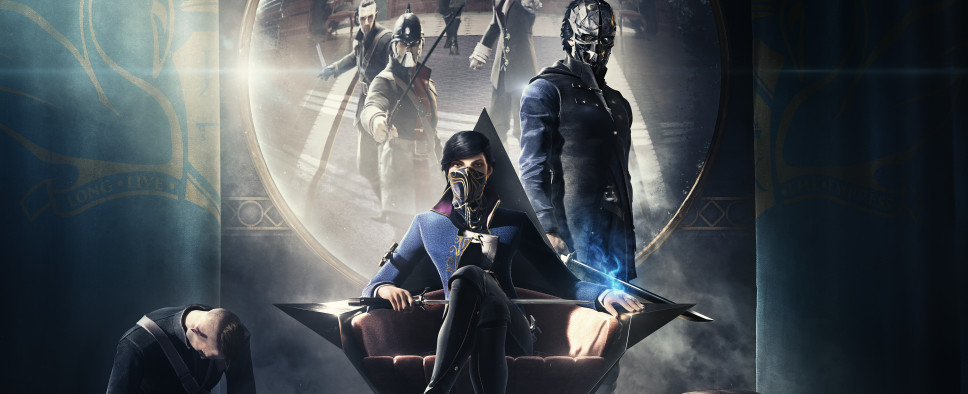
Arkane Studios continues to celebrate its 20th birthday, and as a result, we can now read this interview with Sebastien Mitton, Arkane Lyon’s art director responsible for the studio’s unique visual style. On top of that, you can now pick up a free copy of The Art of Arkane digital artbook where you’ll find plenty of art that inspired the worlds of Dishonored 2 and Prey, as well as Arkane’s upcoming shooter Deathloop.
Here’s the interview:
A perfectly manicured mustache.
A hat that elevates the wearer’s lofty personality – with shoes that ground him, revealing a subtle hint about his position in society. No, we’re not talking about a character in an Arkane game – but we very well could be. Instead, we’re talking with the very stylish Sebastien Mitton, Art Director at Arkane Lyon, about art and style itself – a forte for both Arkanes and an essential part of the studios’ DNA.
IN TRUE ARKANE STYLE
“The style of Arkane comes from our love of the immersive sim genre,” says Mitton. “Arkane creates original universes, and even if we select references to feed our projects, we create everything from scratch. We pull inspiration from every medium imaginable – paintings, photography, existing locations, fashion, books, animation, VFX… the list goes on. Style is born at the earliest stage of production – from the very beginning – by the desire to create unique environments and characters, and the style we choose drives almost every other element of the game forward.”
But things can’t just look cool for the sake of looking cool. According to Mitton, artists must always consider the context of the game. Every artistic choice is part of the world and serves a purpose. A game’s specific art direction supports every other element of the game – from action and sound to the development of the game’s core mechanics. “The art always supports the gameplay, not the other way around,” he tells us.
At the same time, it’s essential for Mitton and his team to create art that is stylized and, in his words, “stick to it.” That’s one of the factors that makes an Arkane game feel timeless – it’s less about realism based on current technology (which will always look dated with every new advancement) than it is about a clear and consistent vision. “The style is also the result of the fact that our environments are very dense and made for exploration,” Mitton adds. “This forces us (in a good way) to manage what we see on screen – details in the foreground, stylized silhouettes in the background – in order to maintain good readability. We want players to have interesting visual stimulus, but we obviously don’t want to overwhelm them. This is the same approach seen in many artistic movements.”
APPLYING ART TO A NEW WORLD
Fully embracing Arkane’s design philosophy means finding the right references for every project. The foggy streets of London couldn’t serve as the visual inspiration for the island of Blackreef like they do for Dunwall. Each game is different, and so each game has to look and feel different.
“Each project is a new challenge and we innovate by creating new worlds and new locations driven by completely new themes and motifs,” says Mitton. “This is, of course, still the case with DEATHLOOP, both in terms of location and atmosphere, as well as the time period reflected in our alternate world. The 60s are new to us, and it’s this desire to explore that leads us to create new things every time. So you should definitely expect to do some traveling through time and space if you enjoy Arkane games.”
Each Arkane world also has its own unique story – and history. A world without a sense of self is forgettable, and that’s the last thing Arkane wants to deliver. Players should get lost in these worlds, spending hours exploring and learning their secrets. They should feel invested. Through art and design, narrative and mechanics, each setting and its inhabitants must feel real and believable because that sense of immersion is at the heart of every Arkane game, and it all starts from a bird’s eye view of the world in question.
“Our art direction is the result of blending elegance and contextualization,” says Mitton. "This drives every prop, environment and character to be interesting and appealing to the player. To achieve that goal – and only after the production phase where we gather good references – we start with satellite view of the world. We think about the overall picture. The shapes and colors of our worlds. The feeling you get you when you see it from a distance. We examine the ‘bigger picture’ as it were, and we slowly zoom in and refine all the elements from there.”
“When we reach a street level, we start to think through the minds of the inhabitants,” Mitton continues. “If I were to leave here, what would I expect? Wood was the main material in Dishonored 2 because of the trees circling Karnaca. Metal was overwhelming in Dishonored 1, adding to the oppressive atmosphere of Dunwall. But what about the island of Blackreef in DEATHLOOP? No trees on the frigid island. No real oppression to speak of – unless you’re Colt. So after we decided on our time period inspiration, we decided to play with the old metal structures and concrete from a Cold War era, mixed with the frivolity of 60s pop culture. This visual juxtaposition was the trigger for the uncommon style and mood seen throughout DEATHLOOP. This is a huge team collaboration between lots of different departments – concept, level design, audio, animation… we all make sure we keep the style, the fun, and the exploration coherent and interesting.”

