Legends of Amberland: The Forgotten Crown Major v1.20 Update Available
-
Category: News ArchiveHits: 1093

Silver Lemur Games’ old-school Might and Magic-inspired dungeon crawler Legends of Amberland: The Forgotten Crown has received a new update that upscales the game’s visuals, introduces keyboard-only controls and fixes a few bugs. You can read the complete patch notes over here, while below you’ll find a general overview of the game and its new update:
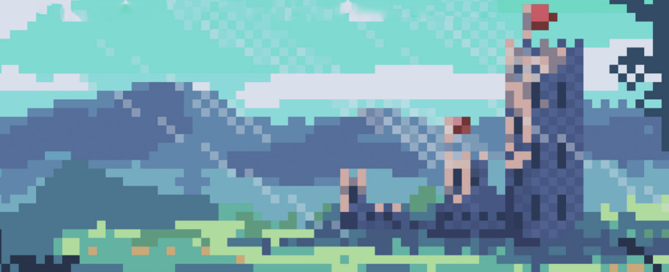
Warsaw, Poland, July 28th, 2020 – Legends of Amberland: The Forgotten Crown, a retro indie dungeon crawler RPG has received a substantial upgrade patch on all platforms (PC & Switch) which updates almost all of the game’s graphics assets. All 3D visuals (monsters, landscapes, dungeons, items, locations, etc.) have been significantly improved in both resolution and quality.
Additionally, the game received a myriad of improvements, fixes both big and small to its UI, mechanics and other elements (most notably the shop/magic shop prices) as well as difficulty level rebalancing - something that was widely requested by players since the game’s launch. The update is accompanied by a new game trailer, released on Nintendo eShop.
About the game: Legends of Amberland: The Forgotten Crown is a retro-style, western turn-based dungeon crawler with RPG elements and a fairy-tale like story of noble heroes on an epic quest. Its grid-and-90-degree-rotation-based movement system evokes such classics as Dungeon Master or Eye of The Beholder 2. The game tells many little stories, that help make its vast, open world feel very much alive.
Story:
The overarching story revolves around the player's party of heroes (custom or pre-made) and their search for a relic of days past - the Amber Crown - an object allowing its wearer to control a great power, cursed by evil forces to be forgotten, erased from history. It supposedly belongs to the ruling king by birthright, and with the ongoing Ogre invasion, is something the kingdom desperately needs to survive the onslaught.
Gameplay features:
- Classic, 90 degree rotation, FPP, turn-based, tile movement RPG.
- Up to 7 highly specialised party members. (Pre-made or established through extensive character customization.)
- Expansive, meticulously designed open world, with organically designed progression paths.
- Many modern takes and improvements on the classic dungeon crawler formula. (Simplistic, fast-paced combat; easy inventory management, unlockable fast-travel, and more!)
- Easily digestable, fairy-tale story of noble heroes on an epic quest in a high-fantasy setting.
- Streamlined gameplay mechanics for ease of use with complex calculations behind the scenes.
- Designed with people who don’t have much time for gaming on a day-to day basis in mind.
Additionally, this post on the studio’s website shares some behind-the-scenes details about the game’s visual update. Check it out:
Yesterday, Legends of Amberland got an update upscaling all 3D view assets to 64px on all platforms (Steam, GOG, Nintendo Switch). Here is the full story behind the scenes of this interesting & important decision.
It goes like this. A long, long time ago I started the Legends of Amberland project with an assumption that all 3D view assets (landscape, monsters, map features, dungeons, etc) would be made as 16×16 pixels. It was consistent and it was looking unique in the artistic sense, I liked it. I posted some screenshots on a few forums (mostly RPG Codex) to get feedback, the response was rather positive with the exception of artistic style which was mixed. Still, I resisted for a while to adjust it, my main objection was that if I up it to 32×32 pixels then soon people will complain they want 64×64 and then 128×128 pixels. Then I went to Pixel Connect 2018 in Warsaw, it’s a very tiny but nice expo for industry members only, and exhibited the prototype of Legends of Amberland. I got a quite positive feedback but… the feedback regarding visuals was interesting. Some people hated it and some said “they don’t play such games for art”, in short people either disliked the art or were indifferent to it, no one, or very few have fallen in love with it. That’s when I decided to go for 32×32 pixel size.
So, the game was launched in Early Access with 32×32 pixels art assets. The reaction to the art style was much better than to 16×16, now some people loathed it, some didn’t care and some loved it. Which is a desired outcome for an indie developer who does not aim for mass market, you care about how many people love your work not how many hate it and definitely you don’t want to make it feel “average” or “compatible with tastes of the most people” as AAA companies are forced to do. Some people loved the art style which meant for me that it serves its purpose. Anyway, it was a good art style for the project and I thought it would be the end of the story.
As time went on and the game became more and more popular one thing occurred to me. There was a portion of potential players who would enjoy the game but the art style made them unable to play it and that there was some portion of the fan base who played the game despite the art style, they enjoyed the overall experience but they were suffering due to incompatible aesthetic. I don’t like when my loyal players suffer, so it made me sad. That’s when I started to think about the possibility of upscaling the graphics yet again. Maybe for a sequel as I thought at the time.
Then, one day, when I was on a walk with my wife and the small one, I got a call from Wojtek Kubiak (CEO of Pineapple Works, the company which made the port of Legends of Amberland for Nintendo Switch), he listed several well thought reasons why it would be great to upscale the art assets a bit. Great, I thought to myself, if he independently thought about the same thing I had, since I never mentioned it to him, it is a no brainer. I answered that I will look into the feasibility of doing it, agreed on the optimal deadline and then I hang up. Next I have chosen the number to Krzysztof “Pixel” Matys (my primary pixel artist for monsters and humanoids) and said to him “Do you remember when we talk about possible 64px upscaling? We are going to try it earlier. Can you redo all monsters in one month?” he sighted heavily and promised he will deliver it on time (that’s one advantage of having trusted long term contractors). This settled the hardest part of it since monsters were the most tricky and work intense of this upscaling. I continued to enjoy my evening walk with my family happy I managed to basically finish my part. The next day I looked through remaining assets (landscape, walls, doors, chests, objects, etc) and I contacted Maciej Mrowicki (my another pixel artist who so far did smaller assets) and asked if he can handle upscaling the rest, he said it’s no problem (he delivered it much earlier that I expected and without any fuss, which earned him +2 levels on my “artists’ spreadsheet”, so expect more art assets from him on my future projects). In short, I was on a walk, answered one call, made one call, sent one email and then got most of the glory & love from all this upscaling thing while others did 97% of the hard work.
In a few days they delivered me the example upscaled assets, now there was the critical part, do I go for it or not. I assembled it all in the game and… requested changes 😀 I got the revised assets, tried again and… yeah, it was looking good and it was consistent. I gave the green light to the new art style and started collecting incoming assets. Soon it was all done.
Overall, the tricky part was that a significant player base was already happy with the 32px assets version and the game was already released, so the upscaling to 64px was only an option if it was compatible in aesthetic sense with the existing look and feel. Fortunately, the 64px version was very similar regarding the feeling and the impression of pixelated graphics was not lost during upscaling, so it was not a problem. Another tricky part was the simultaneous update on all platforms (Steam, GOG, Nintendo Switch), not an easy task to synchronize it, but we managed to do it.
Oh yes, there was also another reason for the upscaling thing, a tiny little one I have not mentioned to anyone… It got under my skin that some unnice people were implying that the art style choice was just a result of my cheapness and lack of proper budget of my games not a conscious artistic decision. Now you can’t say so, you complainful personas! And I still manged to retain my artistic vision and aesthetics without bowing to your boring generic artistic taste!
In the end, my first suspicion that if I agree to upscale from 16px to 32px they will still want to go further was correct and indeed players wanted to do the thing *again*, so I ended up with a second upscaling from 32px to 64px. Now I wonder, will they try to persuade me to upscale it again to 128px, 256px and so on? Only time will tell…

