Expeditions: Rome Developer Diary - Visual Style (North Africa)
-
Category: News ArchiveHits: 1086

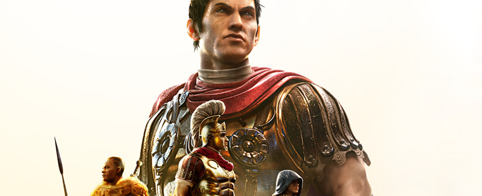
For their latest Expeditions: Rome developer diary, Logic Artists and THQ Nordic focus on the visual style of the upcoming tactical RPG, and in particular, its North African region. If you wouldn't mind knowing more about Logic Artists' creative process and what they mean by "stylized pseudo-realism," you should check it out.
Here are the text parts:
Ave! Today we have a special, fun treat for our 4th DevDiary. Up till now, we’ve been talking about game mechanics, story, and characters, but in each of these posts we’ve been showing off cool concept art and beautiful screenshots. For DevDiary 4, we’re going to be focusing on the Visual Style we’ve been building for Expeditions: Rome. Since the game is so big, we’ve decided to focus on the challenges we faced in recreating the environment of North Africa in ancient times specifically.
We consider the Expeditions series of games to be a kind of historical fiction in game form - a fictional story and series of unusual dramatic events set within the framework of real-world history. This means that while the narrative and the events of the game can be entirely fictional, we always try to keep it grounded, and if not realistic per se, within the boundaries of historical plausibility. We try to never go too far, too over the top, or create elements that are truly fantastical.
This was also the basis for the artistic vision of the game. The previous game in the series ‘Expeditions Viking’ represented a step up in visual quality for us, and when we started work on the project that would become Rome, improving the visuals of the game was on top of our list. The basic overall concept was the same; we wanted to create an exciting and appealing visual representation of the adventures and exploits of legendary generals and explorers, that will be perceived as authentic and immersive, but without being subjugated to absolute historical accuracy.
Creating this kind of authentic historical setting in a top-down computer game, which is inherently unrealistic in nature, is a core challenge of working on Expeditions: Rome. Compromises had to be made, but we always aimed at making the visual design naturalistic and grounded - enhanced with a measure of stylization and idealization, but not fantastic exaggeration. Stylized pseudo-realism, if you will.
One of the visual aspects that seem quite common in historical games is that they tend to overall not be very visually exciting, but instead rather drab, or even colourless. It is as if visual blandness equals realism, and this is something we wanted to avoid at all costs. We wanted our game world to appear as vibrant and appealing as any fantasy setting; something that will excite and immerse the player and make them want to explore our world. In Expeditions: Viking we were fairly strict about historical accuracy, but in Rome we have loosened up on that a little bit to make room for more of the fantastic and extraordinary.
A huge challenge for us was tackling the visual design and presentation of the Northern African region in the game, a sizable part of which is barren desert. One of the risks we faced was that the environment could end up appearing boring and repetitive, and without much color variation or other elements to visually please and excite. This could potentially be very counterproductive to our goals of creating a vibrant world that the player would want to explore and become immersed in.
The first stage in this process started with a lengthy period of research, to gain an overview of the North African landscape, it’s flora and fauna, and finding out just how varied and interesting deserts and their surrounding areas can really be. On top of that North Africa was a lot more fertile two thousand years ago, but since there are unfortunately no photos available from that time, we had to rely on written sources and artistic discretion instead.
Once we had gathered enough material that we felt we had a good basic overview, we started translating it into simple concept sketches to explore the visual opportunities that the limitations and properties of the natural environment afforded us. We asked ourselves “how much can we push this visually and how interesting and magical can we make it look, while still depicting a believable real-world environment ?”
After this initial stage, the next step was designing the specific environments and locations in the game. We realized early on that lighting would be a critical factor and that we could use it to infuse the desert environments with some much needed color, vibrancy and ambience.
Levels can be explored at different times of day, and we wanted the lighting to be distinct and to almost transform each level; creating a different visual experience depending on the time of day the player visits it, despite everything else in the level staying the same. This can be directly traced back to the early explorations we did, but revised and refined to find a balance that would work for us.
An example a game location is the Court of Heaven, which is an oasis settlement of the Nasamones - a mysterious tribal people, about whom very little is known. This afforded us a lot of freedom in the visual design of the faction and inspired by present day Bedouin and Berber peoples. We settled on a very colorful style which would not only provide an interesting visual contrast to the Romans, but also allow us to infuse their desert settlements with vibrant colors that provide yet another layer of contrast to the natural desert environment.
Attempting to create the most exciting and cool visuals, while simultaneously keeping it grounded and authentic is a constant challenge, but it’s one we’ve put a significant amount of effort towards. At the end of the day it is up to the players to judge if we did a good job or not, and we hope that they will enjoy exploring the world that we have created.
Love art and want to hear even more? Join us for our fourth DevStream on Wednesday, July 7th at 1:00 PM Eastern / 5:00 PM GMT on the THQ Nordic Twitch Channel: http://twitch.tv/thqnordic where Senior Producer will spend the entire stream chatting with Art Director August Hansen about the visuals of the game. We’ll be going into more detail on topics from this Diary, as well as showing off even more art, and possible some sneak preview behind-the-scenes footage captured directly from the art team. And don’t forget, any comments posted here on the DevDiary will always be top of the list for being answered live on stream.
We hope you’ve enjoyed this DevDiary on our visual style. We have a super exciting Diary coming up on Music next, which we think you’re REALLY going to love, so get hyped!
Until then, Valete!

