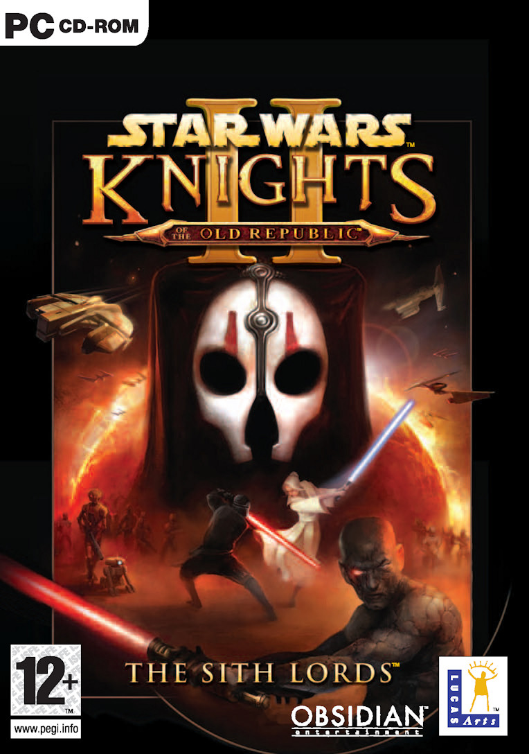
Star Wars: Knights of the Old Republic II - The Sith Lords Preview
-
Category: PreviewsHits: 12460

Article Index
Part of what makes these companions unique is their gear, and you'll find hundreds of new items in The Sith Lords. The workbench weapon/armor upgrade system of KotOR is being modified to include dozens of new combinations and options for items, and best of all will be partially dependent on what skills you choose and their current level. For example, if your character has a high stealth skill, you should have more stealth-tailored upgrade options at the workbench, and as your skill improves, so will your number of choices. Don't worry, lightsaber upgrades are being re-designed as well to include a mountain of new choices including colors and types of crystals.
Another upgrade is with the mini-games. They're all back: Swoop Racing, Ebon Hawk gunning, and Pazaak playing, but they're all being re-worked to add more depth and fun. Pazaak will be getting new cards, Swoop Racing more options, and Ebon Hawk gunning less singularity. Perhaps most importantly, they're all optional, including the gunning.
The improvements to the game come not only from items, upgrades, mini-games and character dynamics. The graphics and interface will receive slight tweaks as well, though since the first game worked so well, the changes in these areas are going to be more cosmetic and functional. With the graphics, slight improvements are being made to the lighting system as well as number of polygons, and they are also introducing weather effects. The animations for the characters are going to be at least doubled, as they've implemented a new system in which as your character improves in ability, the animation tied to that ability will also evolve. No longer will each tier of the Force Push series look identical; with each new level of power, there will be a new "push" animation.
The interface has stayed essentially the same, but you'll notice a number of key improvements. There is a new auto fade out of the main interface when exploring the world and not in combat or another action, resulting in a virtually full-screen view of your surroundings. An additional quick change button has been added to the action bar which allows you to change up to two weapon configurations on the fly. Being a veteran of several KotOR play-throughs myself, it was in my opinion one of the most needed things to be changed. Hopefully they'll take fan input and add the ability to quickly scroll through your inventory and select more than one item at a time as well.
As you've undoubtedly gathered by now, KotOR II is shaping up to be a worthy sequel to one of the best RPG's of all time. Time will tell if Obsidian Entertainment can juxtapose all the improvements into something just as engaging as Knights of the Old Republic, but if all we have to go on is the credentials of its employees, I'd bet on their success.
Related Games:
Star Wars: Knights of the Old Republic II - The Sith Lords


