The Banner Saga Review
-
Category: ReviewsHits: 12388

Article Index
Offering more varied objectives would have helped a lot, as would have offering more varied map layouts. Tellingly, one of the battles I consider the most memorable was conducted atop a crumbling tower, with several tiles that couldn't be walked upon. The Varl units, which made up the majority of my party and occupied 4 tiles each, were clumsy in that arena, and were left vulnerable to the hit-and-run tactics of the enemies' ranged units. It made for an extremely interesting fight, in large part because it scratched a different itch from most of the game's encounters, focused so narrowly on maneuvering as it was. To be fair, the game attempts to shake up things for the final battle, but the results are nearly disastrous: rather than serving as a capstone, it ends up being a frustratingly gimmicky fight, which severely limits your approaches and forces you to use two characters you might have safely ignored for the rest of the game.
But perhaps The Banner Saga's biggest problem when it comes to combat is that its battles feel strangely disconnected from the rest of the title. Emblematic of this are the mechanics regarding a unit's defeat in combat: during story events, a single inconsiderate choice can lead to a character's untimely death, but in combat against hulking brutes, it only leads to a small (but admittedly annoying) Strength malus that will usually heal within a few in-game days. Furthermore, losses very rarely lead to game-overs or have in-story consequences, while pyrrhic victories because of the high number of injuries sustained aren't an uncommon occurrence. Blurring the lines between victory and defeat is an interesting move, but feels jarring when compared to the harsh outcomes the rest of the game reserves for bad leaders.
Of Carvings and Songs
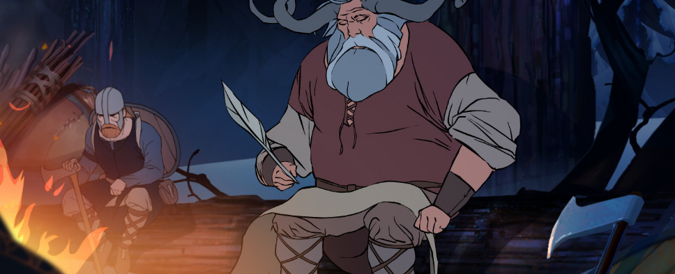
Hopefully in the future someone more versed in art than me will write an essay about The Banner Saga's art direction, because there's certainly enough material: I've already mentioned, at the beginning of this review, that the artwork is inspired by the works of Eyvind Earle, but that doesn't quite give the idea. More properly, it's a tribute to the artist's work, one that lovingly recreates even the unintended quirks of the art style to make new, different material come to life. What never ceased to surprise me while playing the game, was how well the art suited the game's themes and story. There's an understated tension between the beauty of the images on screen and what they depict, one that is also echoed in the sorrowful notes of the game's understated but always present soundtrack, which is not quite as good as the art, but still praiseworthy.
There's no doubt that the game isn't a high-budget production (tellingly the only voice acting is some short narration to accompany the salient moments of the caravan journeys), but the work that has been done puts to shame all but the best looking AAA productions, and it's not a coincidence that it's often the first thing to be mentioned about the title.
Technical Quirks
I have to admit, I was surprised by how little the interface in the full game seemed to have advanced compared to the early days of The Banner Saga: Factions, the competitive multiplayer off-shoot of the title. Despite the large amount of time that passed between the backers-only beta of Factions and The Banner Saga's release, very few improvements have been made: most of the actions are still only available through cumbersome radial menus, and basic actions, for example attacking an enemy, can take a multitude of clicks. I'm well aware that we're talking about a turn-based title and that therefore there's no need to rush, but I'd have really preferred to interact with the world with a better interface. It doesn't help that information is also often hidden behind menus, and that occlusion problems often arise in combat when too many units are close together. A recent patch has added some keyboard shortcuts that I imagine will be helpful, but as far as I can tell the team isn't planning to improve the interface in the future, a rather unfortunate decision in my humble opinion.
Another, frankly, very perplexing design choice, concerns the saving system. I'm sure the team had reasons to not implement a manual saving system, but I have difficulty imagining what they could have been. The game auto-saves extremely often, without any input from the player, and overwrites your old saves when you start a new game. Compared to Shadowrun Returns, another Kickstarter-funded title that employed an unorthodox saving system, it feels a lot more usable, but I still struggle to think of any benefit compared to a manual save system with multiple slots and the occasional auto-save.
The End
Like its stylized landscapes, The Banner Saga is capable of evoking a lot with a simple brushstroke, enough not to feel strangled by its short length and mechanically narrow focus. And while, unfortunately, the precision of the art isn't matched by a similar precision of design, it's still a commendable first effort, and a game well worth experiencing.


