Dragon Age: Inquisition + Jaws of Hakkon DLC Review
-
Category: ReviewsHits: 21080

Article Index
And for a game that puts the emphasis on side content and exploration, Dragon Age also gates new zones by the way of a new currency, called "Power". To open new zones, it's necessary to spend a certain amount of Power, and the requirements increase as the game goes on. Power is usually earned by completing quests and similar activities. This leads to a really strange conundrum. It's easily possible to beeline through the game and only complete the main quests, but to explore more areas it's necessary to do more side content first. It's an annoying mechanic that takes the wind out of exploration's sails in an attempt to encourage players to play even more side quests. I really wish the side content was more engaging in the first place.
For that matter, I also wish side content was better integrated. The game's main missions feel walled off and disconnected, as if they had been surgically removed from another game and inserted into Dragon Age: Inquisition. They're the closest the game ever feels to a BioWare title, but never seem to acknowledge the fact that the Inquisitor can spend days and days hanging around doing quests for the small folk. In fairness, no part of the game seems to acknowledge the extreme amount of pointless side quests.
Nods to the Past and an Awkward Present
There are a couple of odd design choices that I'd like to mention in this review. Some of them are attempts from BioWare to stay true to the first two titles' designs, others are attempts to establish Inquisition as its own thing. For example, given Dragon Age: Inquisition doesn't have skills anymore, BioWare decided to implement a special action for every class. Warriors can destroy walls, Mages can energize to rebuild some structures or solve puzzles, and Rogues can pick locks. Of those abilities, the most useful is without doubt the Mage's, while the other two can usually be skipped. It's a poor substitute to actual character skills, and it has the side effect of punishing non-traditional party compositions.
Dragon Age: Inquisition also introduces Inquisition perks. These perks are party-wide and can be gained by leveling up the Inquisition's Influence, which is usually done simply by completing side quests. At every Influence level it's possible to select a perk. These range from dialogue-based to perks that supply crafting materials. It's a smart way to reinforce the feeling of leading an organization (something the game usually fails at) and introduce some additional customization. Unfortunately, the perk selection's balance is hilariously bad. Having to choose between gaining new dialogue options or some crafting materials that can easily be found while exploring for 5 minutes is no choice at all.
Finally, there is a multiplayer mode, presumably introduced because Mass Effect 3's multiplayer mode was very popular. It feels vestigial, but has the benefit of showcasing how the combat flows much better when it only focuses of one of its two sides (in this case, the action-based third-person side), rather than as a hybrid. The multiplayer mode also includes an option to buy new loot chests, which contain randomized loot, with real money. As far as micotransactions go, this is a pretty tame implementation and can safely be ignored, though the principle is still worrisome.
Presentation
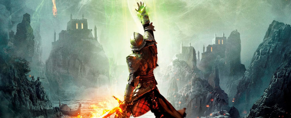
Dragon Age: Inquisition reinvents the Dragon Age art style yet again. The brown Lord of the Rings-style fantasy of Origins is a mere memory at this point, but the drab watercolor look of Dragon Age II don't make a return either. Instead, Dragon Age: Inquisition opts to couple bold, exaggerated shapes with realistically rendered textures, and marries this look with saturated colors and high contrast lighting.
This works well as far as the environments are concerned. The game's huge areas are lovingly crafted and striking to look at. The static weather conditions hurt the impression of a living and breathing world, but help the visual identity of the game's areas. The game is full of towering buildings, huge statues, massive cliffs and vistas. None of the environments is particularly original, but they're all well-crafted.
The character models, on the other hand, are very hit and miss. Several of them have very odd proportions and are just ugly to look at, and not in a way that feels realistic. I have no problem with characters that are meant to be ugly, and I'm more than open to characters that are meant to be unconventionally attractive, but when I look at Iron Bull's comically tiny head or Solas' odd facial proportions all I see are artistic mistakes.

